Developing KanaDate: Learning Japanese Kana with Playdate
When I embarked on creating KanaDate, my goal was clear: design a distraction-free application for people to learn Japanese kana. The Playdate console felt like the perfect fit. Compact and easy to carry, its unique crank feature offered an unconventional and fun way to interact with an educational app. I also wanted to do something more fun than the traditional quiz formats that rely on multiple-choice answers. Instead, I sought to create something original using the crank to answer having a unique way of using the Playdate. But it was more complicated than I initially thought! Keep reading if you want to know more about the development process behind KanaDate.
Why Playdate?
The Playdate’s minimalist design ensures a distraction-free learning experience. Its portability allows users to practice anywhere, and the crank inspired me to experiment with mechanics beyond button pressing. This led me to the idea of a circular keyboard. The crank lets players “write” their answers in a fun and interactive way, enhancing the learning experience. I didn’t want to create just another quiz app; I wanted to offer a fresh approach to learning Japanese kana and something that would be fun to use and exciting to develop.
The Application’s Structure
Here’s how I plan to structure KanaDate:
- Home Screen: The starting point for users to navigate the app.
- Learning Screen: Where users explore kana and their details.
- Quiz Screen: The core learning activity, featuring the crank-based keyboard.
- Options Menu: For customizing the experience.
Let’s dive deeper into the development process of each screen.
Setting Up the Home Screen
For now, I haven’t start working on the Home Screen, it’ll be more visual work with an animated background and two buttons to select the next step. I prefered to focus on the difficult part first, the learn and quiz screen. I’ll come back to the Home Screen later.
Building the Learning Screen
I began with the Learning Screen. The goal was to present all kana in a grid, with details about the selected character displayed alongside. To make this work, I implemented:
- Grids: Learned how to create and manage grids efficiently. I can’t recommend the documentation enough and the provided examples from the sdk to get started.
- Lateral Menu Options: Added accessibility for quick actions like starting the selection mode.
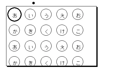
- Grid Navigation: Designed logic to skip empty values, allowing users to jump directly to the next valid kana. If you look at a classic Kana table, you’ll see that some cells are empty, I wanted to skip them to make the navigation easier. The sdk already managed the possibility to loop back to the start if you are at the end of the grid so I didn’t have to worry about that. But I had to manage the case where the next cell is empty and skip it.
- New Fonts: Enhanced the aesthetic appeal by incorporating different typefaces. I needed to adjust the font size and position to ensure readability. Coming from the web development world, I was used to having a lot of fonts available, but on the Playdate, you have to manage with the fonts provided by the sdk. It’s a bit limited but it’s enough to make something nice and especially with Japanese characters.
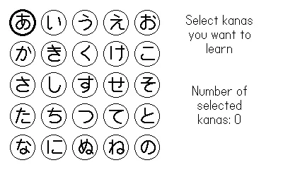
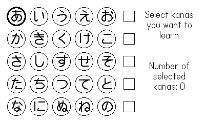
- State Management: There’s multiple state to manage. Is the selection mode active or not, if not I need to display the details of the selected kana. If we are on selection then there’s some update needed on the grid to display the possibility to select all the line directly, but the user can choose to select multiple kana by itself, and I need to detect if the entire line is selected or not. Writing that I’m thinking that I had the possibility to select a line but not a column! I’ll have to think about that.
From a user point of view, it’s just a grid with hiragana characters, but there’s a lot of logic behind to make it work properly and can really be time consuming. Here are some gifs to show you how it looks like:
Once I had a basic working version, I moved on to the next component. I prefer iterative development—creating functional prototypes, progressing step by step, and revisiting earlier work later for refinements. This approach keeps the momentum alive and makes the process feel rewarding. Maybe I’ll write a post about this in the future.
Tackling the Quiz Screen
The Quiz Screen was the most challenging part, primarily due to the crank-based circular keyboard. I started by addressing the toughest elements:
- Drawing Circular Arcs: Implemented arcs that represented keyboard sections.
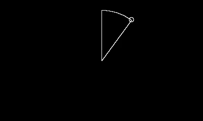
- Multiple Arcs on a Circle: Created a full keyboard layout with several arcs.
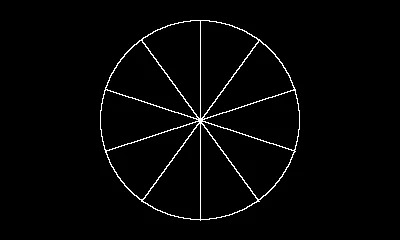

- Text Placement: Placed kana characters on the arcs seamlessly.
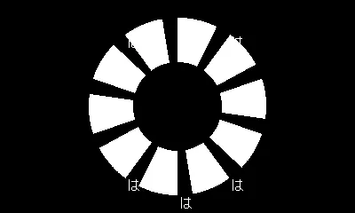
- Sprites vs. Direct Drawing: Initially, I drew polygons directly on the screen, but this approach required erasing and redrawing everything when selections changed. Switching to sprites simplified this process. I lost a lot of time when I switched to sprites because I thought I had a bug and nothing was displayed on my screen. It took me a while to understand that the sprites were not displayed because they were not in the screen area. I had to adjust the position of the sprites to make them appear on the screen. The origin was different than the “all screen” version I was using before.
- Crank Integration: Mapped crank positions to detect valid key selections.
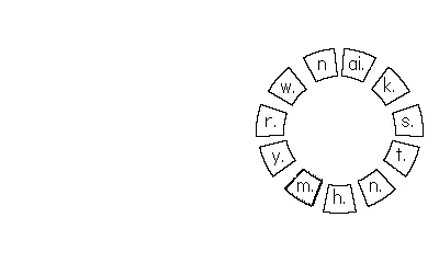
- Multi-Level Keyboard: Designed a hierarchy where, for example, selecting “K” reveals “Ka, Ki, Ku, Ke, Ko.”
Lessons and Future Improvements
Though the keyboard is functional, there’s room for improvements. I’m not satisfied with the keyboard design at the moment, I plan to use pre-made images with rotation to enhance visual fidelity and consider applying border-radius properties to arcs for smoother aesthetics. I’m not sure yet if the result will be better or not, but I’ll try it and see if it’s worth it.
Reflections on the Process
KanaDate embodies my philosophy of iterative development: prioritize small, functional increments over perfection. This approach has kept me motivated and allowed me to tackle challenges systematically. The Learning Screen, for instance, may not be final, but its current state enables me to progress on other aspects without feeling stuck.
Developing KanaDate has been an exciting journey, blending creativity with technical problem-solving. The crank mechanic added a layer of complexity, but it’s also what makes the app unique and engaging. As I continue refining KanaDate, I’m eager to see how users embrace this unconventional way of learning Japanese kana.
Stay tuned for more updates, and if you’re curious about the process or have suggestions, feel free to reach out!